


2026/02/21

Bloggerデザイン : Expanding Flex Accordion

1. デザインのタイプ
【Expanding Flex Accordion】
Flexboxの伸縮性を最大限に活用した、インタラクティブな画像ギャラリーです。マウスを乗せたカードが滑らかに広がり、写真の全貌を映し出すモダンなレイアウトを採用しています。

Bloggerデザイン : グリッドズームカード

1. デザインのタイプ
【Grid Hover Zoom Card】
洗練されたグリッドレイアウトを採用し、ホバー時にカードが滑らかに拡大しながら、詳細情報が浮かび上がるモダンなギャラリーデザインです。
-
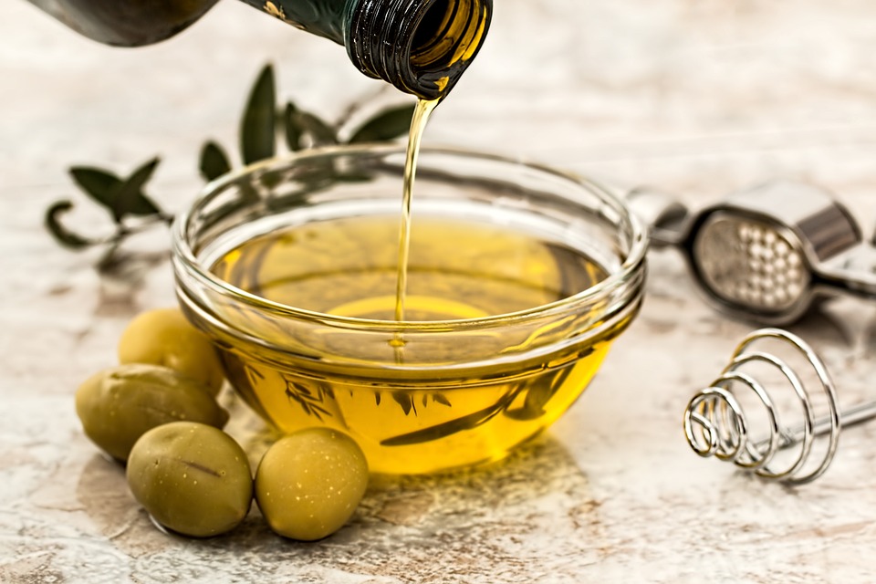
Olive Oil
Our premium olive oil is perfect for cooking, marinades, and dressings.
-

Strawberry
Our strawberries are plump, juicy, and bursting with sweet, succulent flavor.
-

Cheese
Our cheese is made from the highest quality milk and carefully aged to perfection, resulting in a creamy texture.
-

Bread
Our bread is perfect for sandwiches, toast, and more.
2. デザインの特徴
- ダイナミックなズーム
ホバー時にカード全体が1.05倍に拡大し、奥行きのある視覚効果を与えます。 - 階層型オーバーレイ
画像、グラデーション、テキストの順にz-indexを制御し、視認性と美しさを両立しています。 - Blogger最適化設計
Bloggerのリストスタイルや画像の余白干渉を完全にリセットした、安定性の高いコードです。
3. 紹介コード
<ul class="blog-card-grid">
  <li class="blog-card">
    <div class="blog-card-cover"></div>
    <img class="blog-card-image" src="画像URL" />
    <div class="blog-card-body">
      <h2>タイトル</h2>
      <p>本文</p>
    </div>
  </li>

  <li class="blog-card">
    <div class="blog-card-cover"></div>
    <img class="blog-card-image" src="画像URL" />
    <div class="blog-card-body">
      <h2>タイトル</h2>
      <p>本文</p>
    </div>
  </li>

  <li class="blog-card">
    <div class="blog-card-cover"></div>
    <img class="blog-card-image" src="画像URL" />
    <div class="blog-card-body">
      <h2>タイトル</h2>
      <p>本文</p>
    </div>
  </li>

  <li class="blog-card">
    <div class="blog-card-cover"></div>
    <img class="blog-card-image" src="画像URL" />
    <div class="blog-card-body">
      <h2>タイトル</h2>
      <p>本文</p>
    </div>
  </li>
</ul>

<style>
.blog-card-grid { display: grid; grid-template-columns: repeat(2, 1fr); gap: 12px; padding: 0 !important; margin: 0 !important; list-style: none !important; }
.blog-card { position: relative; width: 100% !important; height: 250px; overflow: hidden; background-color: #141414; transition: transform 1s; padding: 0 !important; margin: 0 !important; }
.blog-card:hover { transform: scale(1.05); }
.blog-card-cover { position: absolute; inset: 0; background: linear-gradient(180deg, rgba(255,255,255,0) 50%, rgba(0,0,0,0.75) 100%); opacity: 0; transition: opacity 1s; z-index: 2; }
.blog-card:hover .blog-card-cover { opacity: 1; }
.blog-card-image { width: 100% !important; height: 100% !important; object-fit: cover; display: block; vertical-align: top; margin: 0 !important; padding: 0 !important; }
.blog-card-body { position: absolute; bottom: 0; width: 100%; color: white; opacity: 0; padding: 0 1rem; box-sizing: border-box; transition: opacity 1s; z-index: 3; }
.blog-card:hover .blog-card-body { opacity: 1; }
.blog-card-body h2 { margin: 0; font-family: "Nunito Sans", sans-serif; color: white !important; }
.blog-card-body p { margin: 0.3rem 0 1rem 0; font-size: 0.9rem; font-family: "Nunito Sans", sans-serif; color: white !important; }
</style>

Bloggerデザイン : アコーディオンギャラリー

1. デザインのタイプ
【Vertical Accordion Gallery】
Playfair Displayと縦書き文字を採用した、高級感のあるアコーディオンギャラリーです。

Bloggerデザイン : Expandable Card Gallery

1. デザインのタイプ
【Expandable Card Gallery】
クリックひとつで選択した写真が大きく広がり、細部までダイナミックに見せることができるエキスパンダブル・カードギャラリーです。
2. デザインの特徴
- 写真が主役のギャラリー
選択した画像がダイナミックに広がり、視覚的なインパクトを与えるレイアウトです。 - 心地よい操作感
カードの伸縮が滑らかで、ユーザーが直感的に操作を楽しめる設計になっています。 - スマホでも見やすい
画面サイズに応じて最適な表示に切り替わるレスポンシブ仕様です。 - ブログに馴染むデザイン
テーマの干渉を抑え、あらゆる記事に違和感なく組み込むことが可能です。
3. 紹介コード
ビジュアルを強調したいセクションに最適です。以下のコードをコピーしてご利用ください。
<!-- ギャラリー本体 -->
<div class="vol9-scope">
  <link href="https://cdnjs.cloudflare.com/ajax/libs/font-awesome/6.0.0/css/all.min.css" rel="stylesheet">
  <div class="vol9-container">
    <div class="general-container">

      <input checked class="radio" id="v9-card-1" name="card-vol9" type="radio" />
      <label class="content v9-bg-1" for="v9-card-1">
        <span class="icon"><i class="fas fa-sun"></i></span>
        <h3 class="card-title">タイトル</h3>
      </label>

      <input class="radio" id="v9-card-2" name="card-vol9" type="radio" />
      <label class="content v9-bg-2" for="v9-card-2">
        <span class="icon"><i class="fas fa-cloud-rain"></i></span>
        <h3 class="card-title">タイトル</h3>
      </label>

      <input class="radio" id="v9-card-3" name="card-vol9" type="radio" />
      <label class="content v9-bg-3" for="v9-card-3">
        <span class="icon"><i class="fas fa-cloud-moon"></i></span>
        <h3 class="card-title">タイトル</h3>
      </label>

      <input class="radio" id="v9-card-4" name="card-vol9" type="radio" />
      <label class="content v9-bg-4" for="v9-card-4">
        <span class="icon"><i class="fas fa-snowflake"></i></span>
        <h3 class="card-title">タイトル</h3>
      </label>

      <input class="radio" id="v9-card-5" name="card-vol9" type="radio" />
      <label class="content v9-bg-5" for="v9-card-5">
        <span class="icon"><i class="fas fa-poo-storm"></i></span>
        <h3 class="card-title">タイトル</h3>
      </label>

    </div>
  </div>
</div>

<!-- CSS -->
<style>
.vol9-scope { display: block; margin: 40px auto; font-family: 'Roboto', sans-serif; }
.vol9-container { background: linear-gradient(90deg, #CAF3F2 0%, #6FE3E1 100%); padding: 40px 15px; border-radius: 15px; display: flex; justify-content: center; align-items: center; box-sizing: border-box; }
.general-container { display: flex; flex-wrap: nowrap; gap: 12px; width: 100%; max-width: 1100px; }
.radio { display: none; }
.content { position: relative; flex: 1; border-radius: 48px; cursor: pointer; overflow: hidden; display: block; transition: all 0.5s cubic-bezier(0.05, 0.61, 0.41, 0.95); height: 0; padding-top: 75%; background-size: cover; background-position: center; background-repeat: no-repeat; }
.v9-bg-1 { background-image: url('https://images.unsplash.com/photo-1524572217604-17e96c89e56f?auto=format&fit=crop&w=1867&q=80'); }
.v9-bg-2 { background-image: url('https://images.unsplash.com/photo-1444384851176-6e23071c6127?auto=format&fit=crop&w=1867&q=80'); }
.v9-bg-3 { background-image: url('https://images.unsplash.com/photo-1482406611936-43ea538e39d4?auto=format&fit=crop&w=2110&q=80'); }
.v9-bg-4 { background-image: url('https://images.unsplash.com/photo-1483663167873-0cfcc893b78c?auto=format&fit=crop&w=2096&q=80'); }
.v9-bg-5 { background-image: url('https://images.unsplash.com/photo-1475116127127-e3ce09ee84e1?auto=format&fit=crop&w=2100&q=80'); }
.icon { position: absolute; bottom: 16px; left: 17px; width: 40px; height: 40px; background-color: #FFF; border-radius: 50%; display: flex; align-items: center; justify-content: center; font-size: 24px; color: #E9BE71; }
.v9-bg-2 .icon { color: #303335; }
.v9-bg-3 .icon { color: #1F4782; }
.v9-bg-4 .icon { color: #818C96; }
.v9-bg-5 .icon { color: #AB834C; }
.card-title { position: absolute; bottom: 20px; left: 72px; color: #FFF; font-size: 19px; opacity: 0; transform: translateX(30px); transition: opacity 0.3s, transform 0.3s; transition-delay: 0.3s; white-space: nowrap; text-shadow: 1px 1px 2px rgba(0,0,0,0.5); }
.subtitle { display: block; font-size: 14px; }
.radio:checked + .content { flex: 10; }
.radio:checked + .content .card-title { opacity: 1; transform: translateX(0); }
.content:hover { transform: scale(1.02); }
@media screen and (max-width: 768px) { .general-container { flex-direction: column; } .content { width: 100%; padding-top: 60%; margin-bottom: 10px; flex: none; } .radio:checked + .content { padding-top: 80%; } }

[type="radio"]:checked+label:after { -webkit-transform: scale(1.02); transform: scale(1.02); display:none; }
[type="radio"]:not(:checked)+label:before, [type="radio"]:not(:checked)+label:after { border: 2px solid #5a5a5a; display:none; }
</style>

Bloggerデザイン : レスポンシブイメージギャラリー

1. デザインのタイプ
【Modern Image Grid Layout
複雑なグリッドを組み合わせた、タイル状の画像ギャラリーです。マウスホバーに合わせて画像が鮮明に浮かび上がり、視覚的な奥行きを感じさせる重厚なエフェクトが特徴です。

Bloggerデザイン : スリットヒーロー


1. デザインのタイプ
Dual-Slit Parallel Hero
2枚の画像が鋭いスリットで切り裂かれたような、スタイリッシュなヒーローセクションです。マウスホバーに合わせて画像がダイナミックにスライドし、視覚的なインパクトを与えます。

Bloggerデザイン : ネオングラデーション回転

1. デザインのタイプ
【Neon Rotating Profile Card / ネオン回転アニメーション】
円形のフレームを鮮やかなネオンのグラデーションが回転し続ける、近未来的なプロフィールカードです。ホバーによって画像から詳細情報へと滑らかに切り替わります。


